Brand Guide
Color Palette

The C/F brand color palette is an important component to the brand. The colors have been chosen with intention. Please do not stray from these colors when designing any C/F material. There are PRIMARY, SECONDARY and ACCENT colors in the palette. Our PRIMARY colors are Blue and Green. At least one of these colors should appear in all C/F communications. The SECONDARY colors should be used as a supporting role to the PRIMARY. ACCENT colors should be used sparingly.
LOGO USAGE
The C/F logo is made up of two elements: a symbol and a wordmark. The preferred logo would be the full color logo on a white background. But, to accomodate a variety of design conditions, we’ve created two versions of the logo to work on color backgrounds. When on a dark background the default should be to use the version in all white, but in instances where the background is very dark, we have a light blue version.
To maintain the brand integrity, the logo lockup should not be edited in any way.
Symbol
Wordmark
Preferred: Color logo on white background
Use this light blue version on dark color backgrounds such as C/F Dk Blue or C/F Dk Grey.
This version of the logo should not be used over an image.

Use this all white version on image background or medium color backgrounds

The Logo Symbol can be used alone only after a full logo lockup is seen prior. For example, in a powerpoint deck where the full logo is on the cover slide, and the Symbol is in the footer on subsequent slides.

Fonts
The C/F brand fonts are made up of two families. For headlines, Orpheus Pro, and for body text, Neue Haas Grotesk Display.
Combined these two fonts offer a versatile, friendly, yet serious tone which is important to our brand.
Headlines / ORPHEUS PRO (adobe)
ABCDEFGHIJKLMNOPQRSTUVWXYZ1234567890abcdefghijklmnopqrstuvwxyz ?!@34%^&*()_+=
Body / NEUE HAAS GROTESK DISPLAY (adobe)
ABCDEFGHIJKLMNOPQRSTUVWXYZ1234567890abcdefghijklmnopqrstuvwxyz ?!@34%^&*()_+=
Body text should be used in the brand grey instead of black.
Headlines can be in the grey or either of the two primary font colors
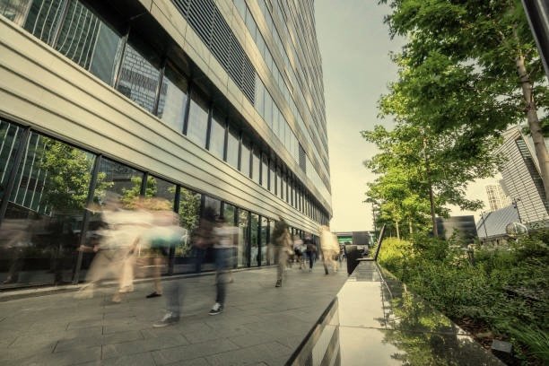
Image Style
Muted color with highlights of the C/F color palette and rich black and white imagery combined. Image subject of office buildings showcasing unique angles. Secondary imagery of people working / collaborating / walking outside buildings and Atlanta skylines.


Additional Images